In this project, we present “Amazon Go Plus” a smartphone application which solves some of the major problems faced by grocery shoppers by integrating existing technologies and services to help people save time, money and create a memorable shopping experience.
Timeline: 2 Months
My Role: Interaction Design, Prototyping & Evaluation
The main goal of the research was to understand the goals, motivations and pain points of the user so that we could design a better solution for them.
We conducted semi-structured interviews with 10 regular shoppers to understand the problem space and their overall experience of shopping grocery from retail stores. This helped us to explore different problems & go deep down into few major issues that they currently face.
We studied a research conducted by Food Marketing Institute (FMI). Some key results of this study showed that though retail stores are still the primary source for grocery shopping among all age groups, shoppers are using digital tools prior to and during shopping trips.
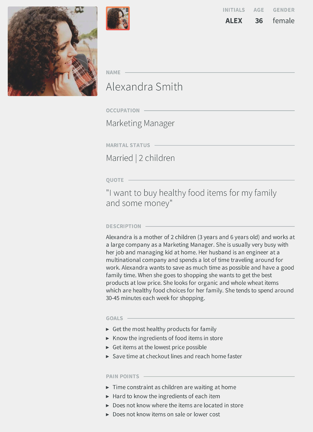
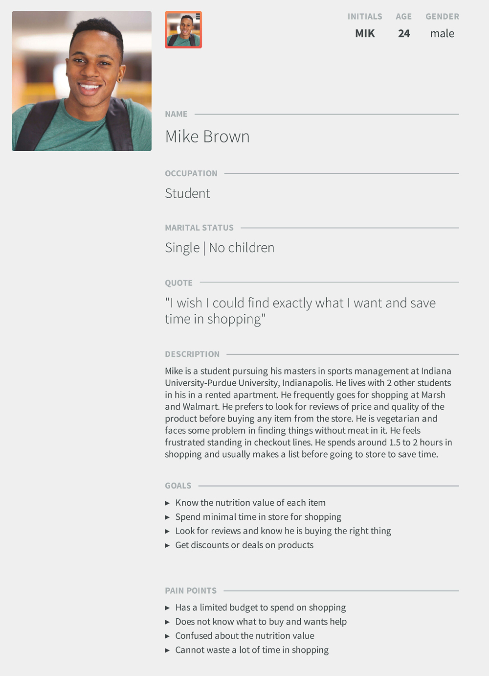
Based on our research data we created two different personas that represent the problems faced by our respondents.
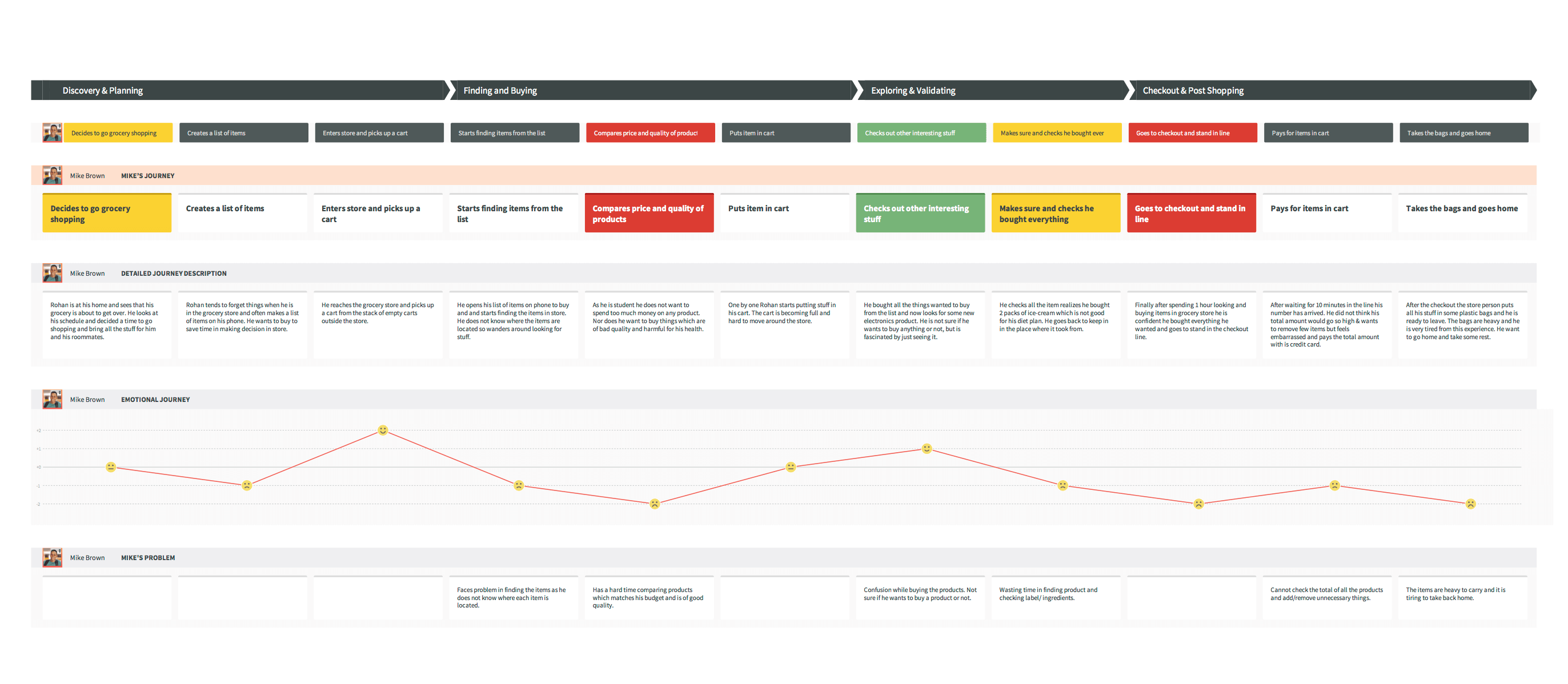
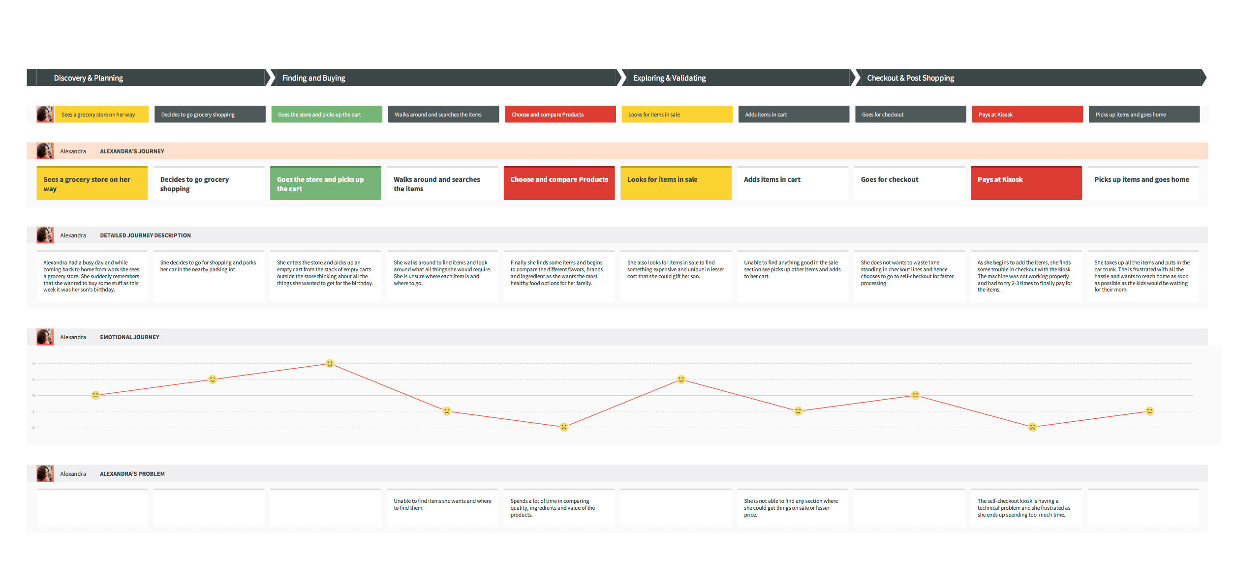
We created journey maps to get an in-depth knowledge about our users, their tasks, feelings, experiences and their mood at different points of time.
Journey map 1 (click here to view full resolution)
Journey map 2 (click here to view full resolution)
The major problems and needs are listed as follows:
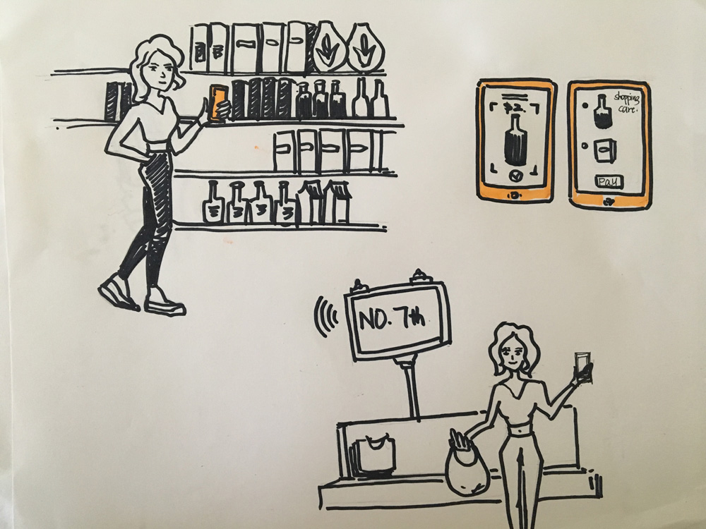
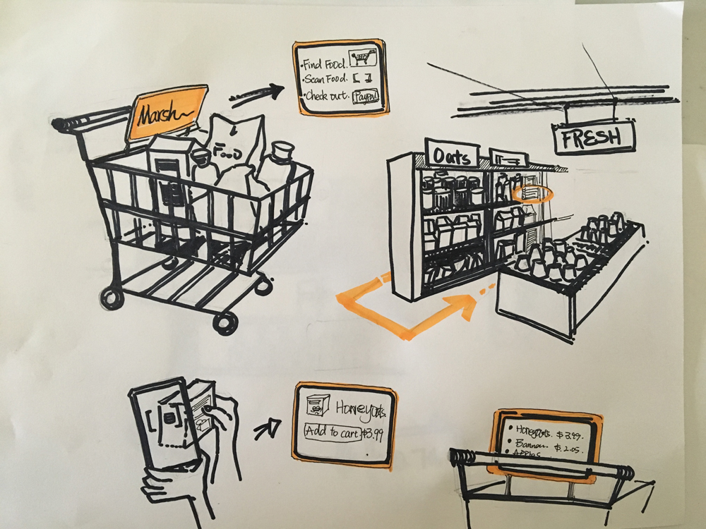
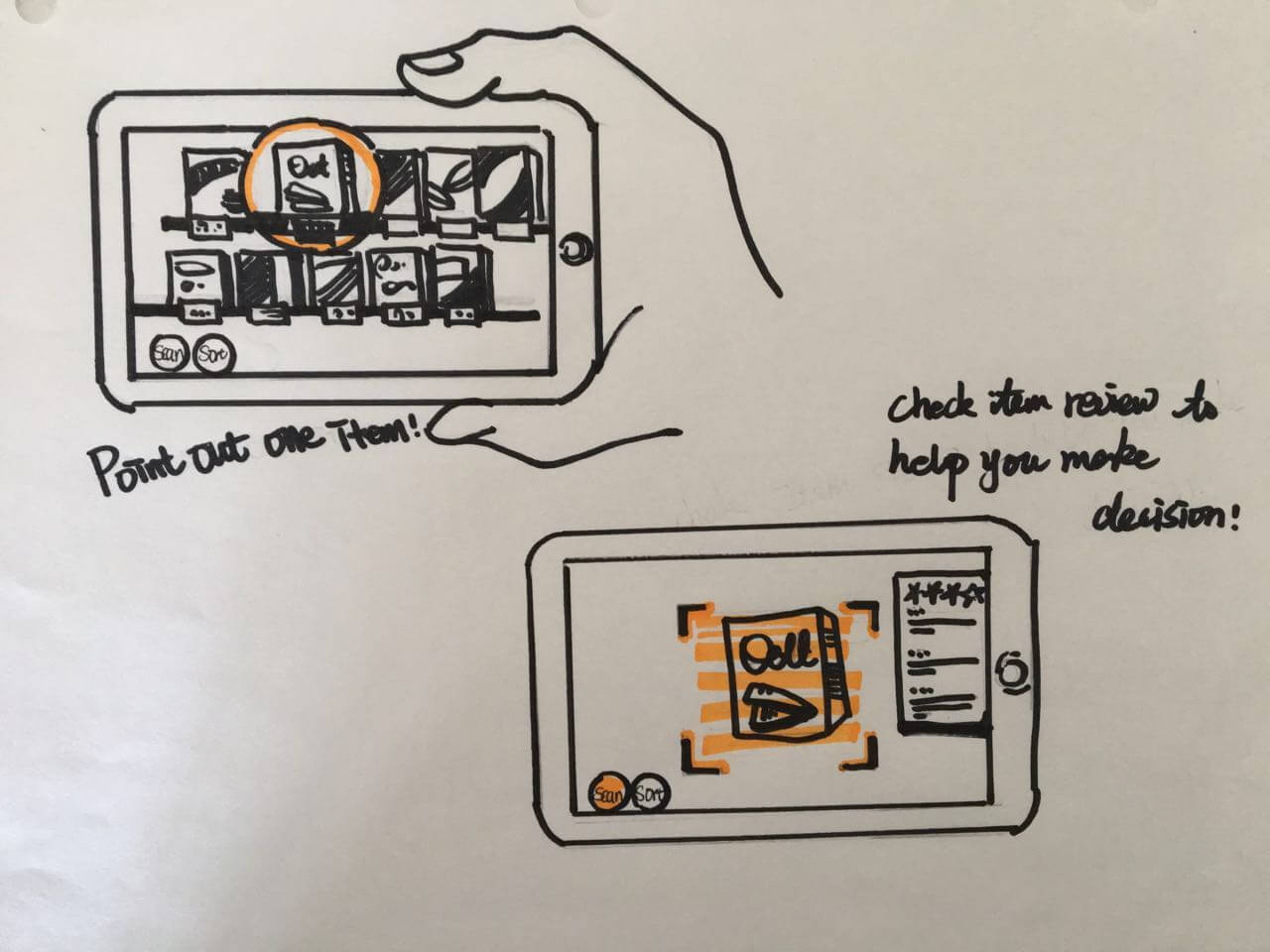
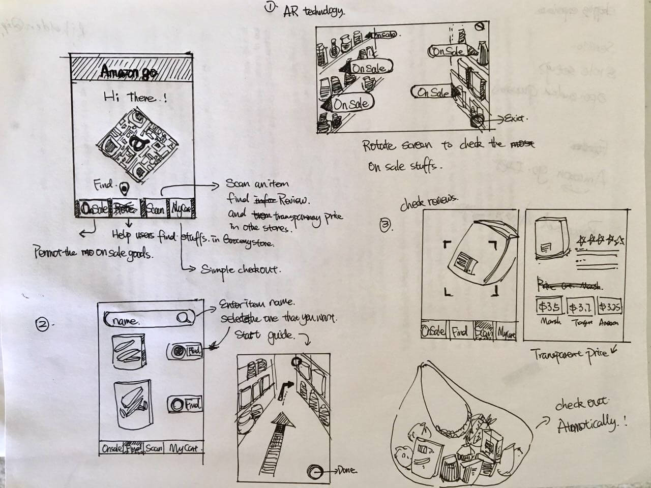
After getting a good understanding of the problem space and the opportunities, we started brainstorming and sketching out different ideas/concepts to help our users.
When researching about existing solutions, we came across Amazon Go. It is is a grocery store concept that utilizes several technologies, including computer vision and sensors to automate much of the checkout and payment steps. Basically, you could simply walk in, grab items, and walk out without the hassle of stading in checkout lines and paying to the cashier. We realized the solution was incredible, and wanted to expand upon it and not re-invent the wheel given that users usually face many other issues while shopping at the grocery store.
We finally decided the main features of our proposed solution 'Amazon Go Plus' which integrates Amazon reviews, Amazon Go smart checkout and Augmented Reality.
Goods on Sale
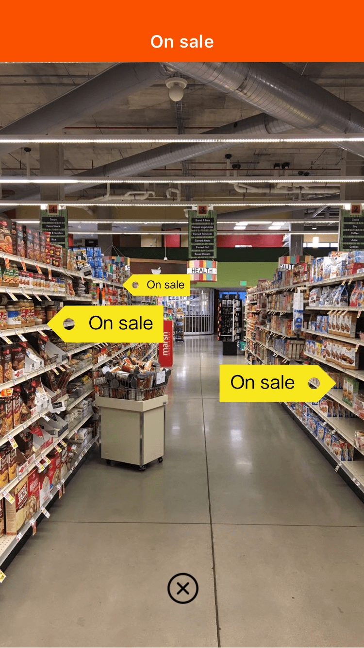
By embedded AR technology, users will be able to check the on sale goods available intuitively.
Locating Items
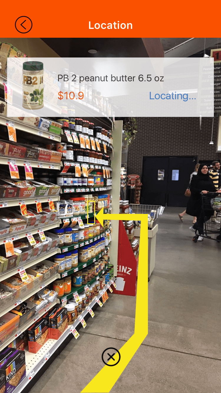
The solution will facilitate users find stuffs they are looking for in large shopping environment.
Product Reviews
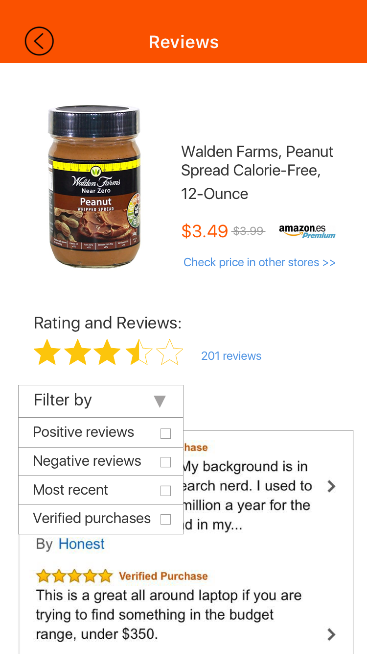
Facilitate and help users to make decisions while shopping by connecting with Amazon reviews.
Transparent Prices
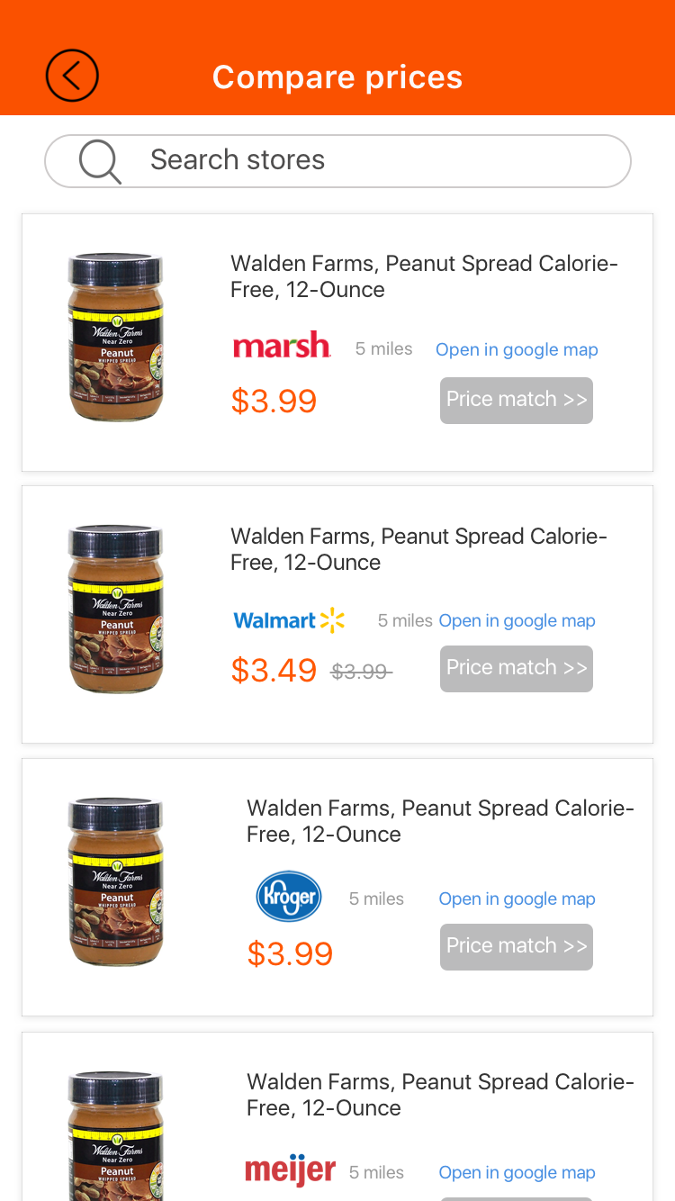
From business perspective, Amazon Prime customers will get the lowest price by 'price match'.
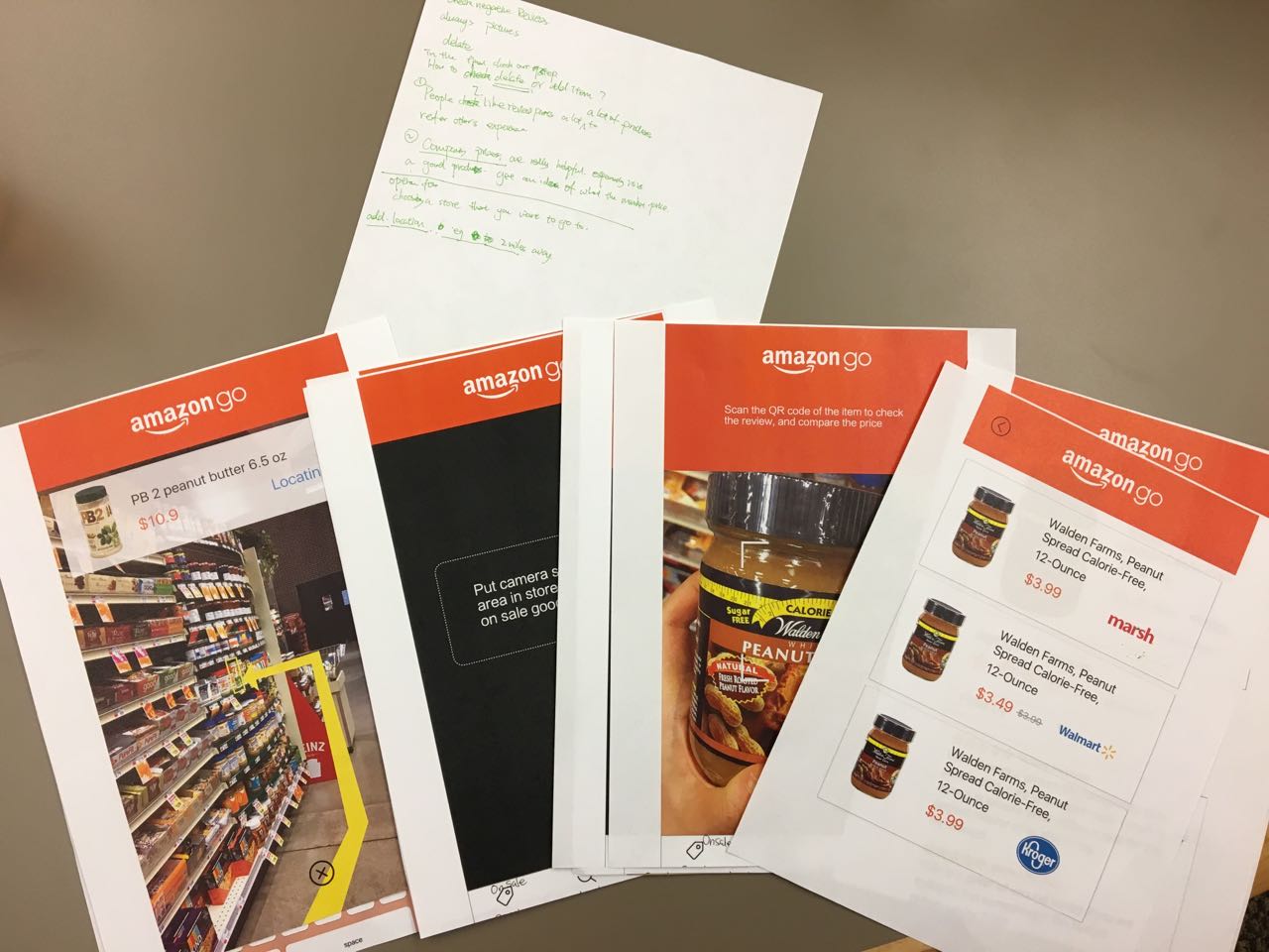
For the first round of prototype, we used Sketch to create image files, printed them out in A4 size and used as paper prototype. After the feedback from the users we did second round of prototyping with the changes suggested and some layout changes.
Welcome page
Home screen
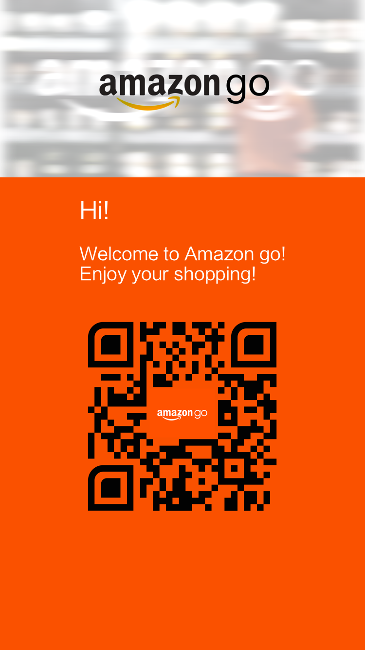
When opening the app, the first screen that comes up has a QR code and a welcome message. We adopted this feature from current Amazon go shopping experience, which starts with a user scanning a QR code at the entrance of the store.
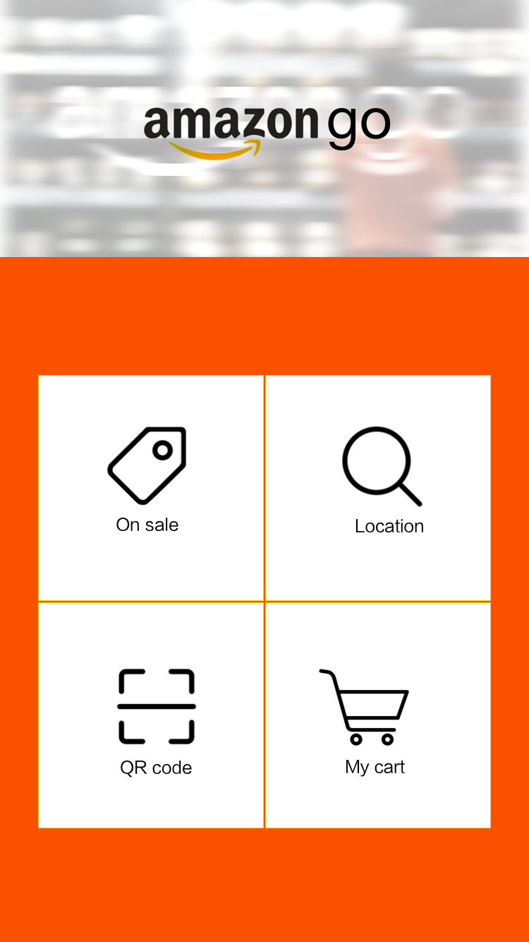
Then, after a user scans a QR code, the user can use the main menu consisting of the four primary functions: showing items on sale, locating an item, scanning an item to show detailed information, and checking items in cart.
Displaying items on sale
Locating items on sale
The image on the left side shows a feature that highlights items on sale. When a user lifts a cell phone to point an aisle, as if taking a photo of the aisle, the cell phone screen shows an augmented version of the aisle showing the items on sale
After typing in an item the user would like to locate, the user can lift the cell phone and look around to find the arrow. Following the arrow, the user can reach the item fast.
Price matching
Product reviews
When a user scans an item using its barcode, the app displays its reviews on Amazon.com. Then the user can check prices in other stores such as Kroger and Walmart.
Finally, a user can take a look at the shopping cart and check the items in the cart so far. It helps the user to keep track of products he/she has bought.
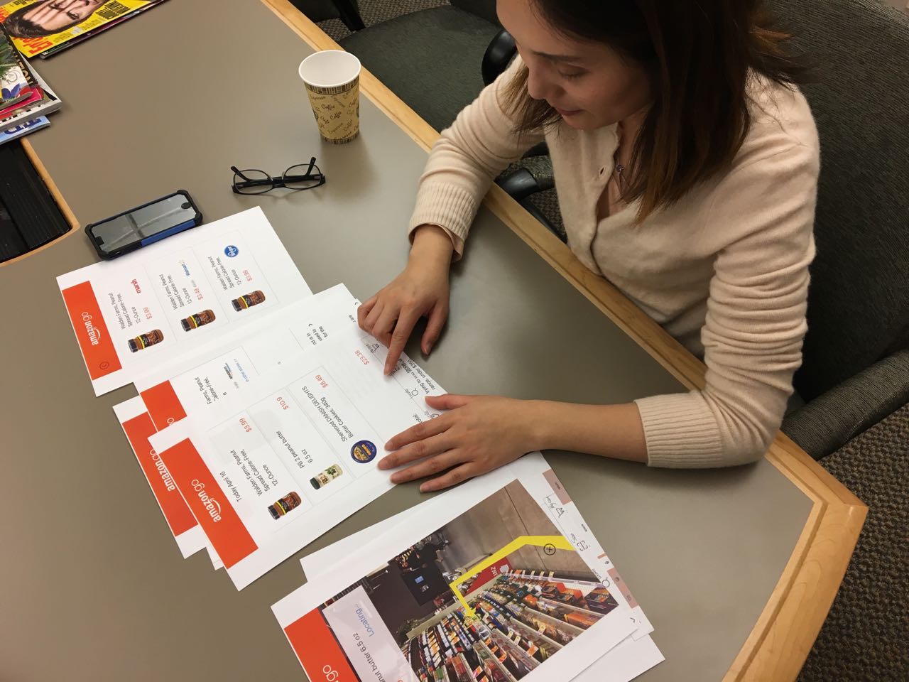
We conducted informal and formal cognitive walkthroughs. Informal testing was done in a controlled environment using paper prototypes & the formal testing was done with the InVision prototype at a grocery store.
We conducted informal walkthroughs twice with our prototypes. The evaluators were HCC graduate students at IUPUI and were frequent shoppers. We printed out the paper prototypes and tested in IT Lab. Both the rounds provided us with some valuable feedbacks for further exploration and design.
We recruited three participants at a local grocery store, Marsh, to test out high fidelity prototype. We asked each of them complete three tasks that utilizes primary features of the app and to think aloud the experience, thoughts or ideas regarding the prototype.
From this testing, we hoped to answer the following questions:
Overall, the participants were very positive toward our prototype. Most of them did not have issues in completing tasks and appreciated the simplicity of design. When checking prices, one participant wanted to check the location of the store that offers the item in the lower price, so that the participant can decide whether they want to make a trip to that store to save money. Furthermore, one participant pointed that the users may run into each other when they are using this application in the store.
From this project, I had a valuable experience of testing with actual users in the actual environment this application is designed to be used. Although it was quite anxious at first to ask someone we do not know for a participation, at the end of the day, I learned that people were quite willing to help. Regarding the iterative process, I realized that the design can look very different depending on the medium it is being presented. When we used the paper prototype, none of the participants had any problem with font size, because the design was printed on A4 size papers. But when we moved the design to a cell phone screen, the participants started to point issues with font size.
The biggest limitation of our project would be that the AR technology was not implemented in our prototype. Therefore, we had to ask the participants to act as if the prototype had the AR feature. If our prototype could have incorporated the technology, it would have led to more discoveries on potential problems our prototype may have. Another limitation is that our participants for testing were mostly young adults. We do not have results from elders, who may be less familiar with AR technology than the participants we tested the prototype with.
Points which are not covered in this case study but could be worth discussing in person:
Thanks for making this far. Here's a gif for you.
Have any suggestion or interested in working together on a project?
Go ahead, I'd love to connect with you.
© Designed & Coded by Rahul Jain